The Create Bridge Footprint Tool in SMS 13.2
By aquaveo on August 31, 2022Do you have an SMS project with a bridge represented in the mesh? SMS 13.2 offers a new tool called Create Bridge Footprint that assists in representing bridge footprints in SRH-2D simulations.
Since the real-life effects of bridges can be complex, creating a mesh to represent them is often challenging. Modeling piers and abutments using older methods in SMS requires many polygons in Mesh Generation coverages. Now, the Create Bridge Footprint tool provides an alternative approach to creating an unstructured mesh under and around a bridge structure. Note that this tool replaces the functionality made available in the Bridge-Piers coverage, which you might have been using in SMS 13.1. However, many of the same settings are incorporated in this tool as well.
The Create Bridge Footprint tool, located in the Toolbox dialog, produces a coverage and mesh that represent the bridge footprint. These features can then be used to create a mesh that incorporates the bridge footprint into the larger mesh for the model.
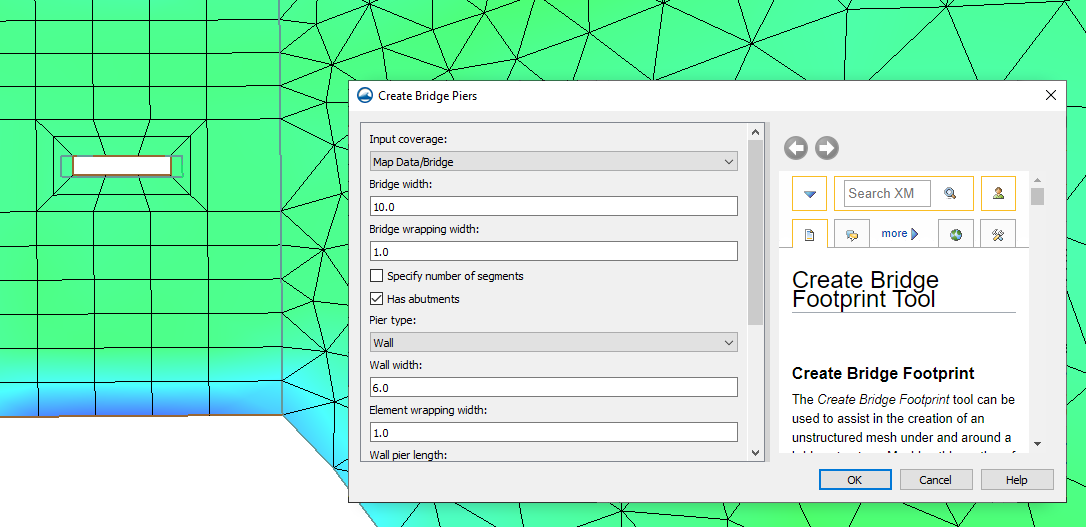
The set up for the tool includes creating a new coverage with arcs that define the new bridge:
- The first arc should define the centerline of the bridge. It is the longest arc.
- Other arcs, drawn across the first arc, define where the piers and abutments are located. The length of the piers is set in the tool parameters before the tool is run, so the length of these arcs is unimportant.
When drawing the feature arcs to represent the bridge for the tool, there are some important things to keep in mind. One of them is that the bridge feature arcs must be the only feature objects in the coverage. Any other objects will confuse the Create Bridge Footprint tool.
It's also important to make sure that all of the shorter arcs cross the centerline, but none of them should intersect the centerline. In this case, intersecting is different from crossing in that it creates a node on both arcs. This splits the centerline arc, making it impossible for the tool to interpret the intended meaning of the arcs.
After setting up the arcs, there are some parameters to set in the tool to complete the model of the bridge. Then the tool can be run and the resulting mesh and coverage reviewed, and you're one step closer to completing your model.
Try the Create Bridge Footprint tool in SMS 13.2 today!